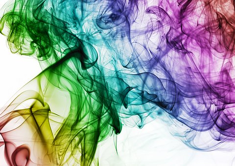
The brand image is a somewhat forgotten topic in SMEs and that large companies exploit to the fullest, but the truth is that the colours and fonts we use for our brand say a lot about us, whether we are big or small.
The fonts and colours that we use in our corporate identity are not minor issues, rather the opposite. Your choice will directly influence our brand image, that is, the way consumers perceive our identity as a brand in their mind. Hence, it is a choice that we must make conscientiously, trying to capture both our personality and values, without ever losing sight of our target.
Each colour and each typography have a different meaning and, although the person who sees them has no design knowledge, they will feel certain emotions and sensations without realising it. Therefore, if we use the psychology that both colours and fonts hide behind, we can create a brand image that conveys what we want our potential customers to perceive of our business. In addition, we will reach our target audience more easily.
If our target is a middle-aged male sector, we should not use the same colours as if we are targeting a teenage female audience. And the same goes for typographies.
If you want a leading provider of printing services helping you establish your brand, here at Morning Star Press you will find more than 50 years of combine experiences ensuring you have the best and most solid image in your area of business.
Did you know that orange stimulates appetite and blue reduces it?
That whoever sees our brand image perceives us as a modern, close, classic, traditional or trust-inspired company, is in our hands as long as we use the right colours and fonts for it.
On the contrary, a bad choice of colours and fonts that will be part of our corporate identity can result in the consumer getting a wrong idea of our company and that our brand image does not correspond at all with what We intended to transmit.
Colours and typography serve to create a brand image and transmit the values of the organisation to the public. Attributes such as modernity, classicism, exclusivity, trust or closeness are associated with specific tonalities and types of letters. Consumer psychology is a very important factor and, if we choose poorly, our brand image will be different from what we want to convey, and those may opt for other options of the competition, so graphic design is something very to keep in mind for our business to work.
Keep in mind the meaning of colours, fonts and shapes, to know what you are transmitting in your brand image
The company Tasty Placement has carried out a study in which it shows us the colours and the most used typographic families in the corporate identity of the main companies of the planet. From it we can highlight that, in terms of colours, blue is preferred by companies to create their brand image, since 37 percent of them use it, followed by red and black, used by 27 per hundred. On the contrary, the colour less used as corporate colour would be purple, a colour that only 2 percent of companies use.
Black. Denotes authority and makes you feel slenderer. It also transmits power, mystery and strength, and is often used to gain elegance and design.
Grey. It indicates sophistication, past times and builds trust. It is a neutral colour, which is why it is often used accompanying other colours, and replacing black to remove hardness.
White. Simplicity, light and cleanliness. It transmits goodness, purity, innocence and spirituality, in addition to being indicated in hygiene and health services and products.
Red. It is an energetic colour and creates a feeling of intensity and aggressiveness, but also of love and passion. Indicated to increase the visibility of specific elements, and to warn of errors or dangers.
Pink. It is the colour of love and true love. It represents feminine qualities and stimulates tenderness and sensitivity. It also has an innocent part, so it is suitable for a pre-adolescent and child target.
Yellow. Informal colour that is associated with light, concentration and dominance. It transmits happiness, intelligence and joy, but it is a delicate colour since too much yellow could become overwhelming.
Orange. Stimulates appetite, gives us a feeling of warmth, and is the colour of creativity. It is perfect for products and services related to creativity, youth and food.
Green. Environment, calm, refreshing, wealth. It is a colour related to freedom, youth and health, and transmits security in a somewhat more informal way than blue.
Blue. Sea, peace, freshness, loyalty … We associate it with sincerity, trust, stability and depth, and it is very suitable for technology, health and cleanliness but never for food as it reduces appetite.
Purple. Luxury, romanticism, sophistication and money. It is a colour that we associate with religion and royalty and can produce some nostalgia, melancholy and sadness.
Brown. Strength, authenticity and security. It is a very masculine and stable colour that we also associate with nature, so it is appropriate to use it in products for men, wines, rural accommodation …
Meaning of the typography
As far as typography is concerned, Helvetica is the star source, with 21 percent of companies that use it in their logos. 63 percent of brands prefer Sans Serif typefaces, 12 percent choose Slab, 11 percent use Script, and only 8 percent use a Serif family typeface for their brand image.
Why this data? What do these font families mean?
- They are associated with modernity, security, joy and stability. The most common are Helvetica, Verdana, Arial, Tahoma and Bauhaus, and LinkedIn is an example of a brand that uses this type of font in its logo.
- Script Creativity, elegance, affection and seduction. Some fonts of this family are Lobster, Brush, Great Vibes and Edwardian, and Cadillac is one of the brands that has chosen this typeface for its brand image.
- Slab Modernity, solidity, strength and boldness. Rockwell, Courier, Bevauo and Museo are some of the sources of this family and brands like Volvo or Sony use them.
- Modern Intelligence, style, technology, trend … This type of font is used by Absolut Vodka for example, and among its fonts we find some such as Futura, Majoram, Infinity or Matchbook.
- Serif Authority, tradition, respect and security. Sources like Book Antigua, Garamond or Times New Roman are some of the ones we find in this family, and Google without going any further is a clear example of who prefers them for their brand image.
Before creating the corporate identity of our business, it is more than advisable to take a look at what the different colours and fonts convey, so we will ensure that we choose the right ones so that our brand image is a ten.
Contact us today for more information and make a top brochure with the help of true professionals with a lot of time offering excellent services to Australian businesses.