Here at Morning Star Press we help you improve your image and branding consistently. Do not hesitate to contact us for top quality printing services.
- Image quality
There are still people who think that the resolution of a monitor is 72 pixels per inch and that if an image prepares it at 10 x 15 cm at 72 dpi, on all monitors on planet Earth it will look at that size. Big mistake. Not all screens have the same pixel density. And then why has that figure been standardized? Well it is something that comes from far, when all the monitors were 15 inches and contained 1024 x 768 pixels. But, of course, things have changed a lot since then, and if before that was a standard, now there is no rule worth. For not talking about retina screens, for example.
All this complication that we find in the digital field is simplified in printing with printers. Here if there is a rule, with its exceptions, as any rule, but a rule after all. Point:
All the images must be at 300 dpi in the size at which they will be printed. That is, if in a triptych there is a photo that measures 12 x 12 cm, they have to contain 300 ppi in that measure. If we lower that figure, it will pixelate.
And the exceptions?
Maybe you’re wondering why to print you need 300 dpi and not another number like 294 or 562. It’s a physiological issue. When we reach that resolution when printing, the human eye is not able to distinguish the points that make up the plot of the image. And in this the distance of the observer has much to do.
Think of books, magazines, brochures, stickers … all these products are designed to be seen at a distance, say, from reading. However, when we print to see things from a greater distance the issue changes.
- The colour mode
The great difference that exists between a screen and a paper, for the matter at hand, is that the screen emits light, while the paper reflects it. And this, friends, is the mother of the lamb.
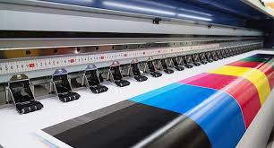
In graphic arts we work with a colour mode called CMYK, corresponding to the acronym in English of cyan, magenta, yellow and black (in fact the K is key, as this key colour is considered). It is a subtractive model, if we add C + M + Y the result would be black. Why then is black ink used if it would be achieved with the other three? Simple, if every time something black was printed it would have to involve 3 inks, the result would be something comparable with a mud.
There are machines that have more than 4 inks, but that we are going to leave for another article, because it is something too technical for what we are pursuing now.
The CMYK mode is also known as four-color process (the one that refers to it as four-color will write it correctly a hundred times in waxing), and full-colour printing is achieved by alternating small dots of each of these four channels. That is to say, the inks do not mix, but are independent points of cyan, yellow, magenta or black that are so close to each other that the eye contemplates them as a unit, as an image. We encourage you to take a magnifying glass and observe a photo of any book.
And now I’m going to the bottom line: the CMYK and RGB colour ranges are not the same, that’s why, among other things, it’s so important to design in CMYK when the job is destined for a printing company. Some may be thinking that you can work with RGB and then pass it to CMYK. You are only half right. Of course, it is possible to do it, in fact in any software such as Photoshop or Illustrator is simply to unmark one option and mark the other, but the problem, as I said before, is that the colour range is not identical and, therefore, there are colours in RGB that do not exist in CMYK and vice versa.
Many shades of violet cannot be reproduced in CMYK or, to give another example, pure blue is impossible to achieve in four-color.
- Margins
Bleeding, bleeding or blood. Three synonyms to name one of the most important issues that you have to take into account. Let’s talk a little about it.
Imagine that you are going to print posters of 70 x 100 cm. The poster is entirely occupied by the photo of a Norwegian landscape. So you design it to that extent and you access our online printing to make the order. But there is something you do not understand. In the tab of that product you read:
Design size: 70.4 x 100.4 cm
Finished size: 70 x 100 cm
What is this? Our friend the margin, who has arrived to water the party. These figures correspond to the 2 mm that you have to add to each side of the design document, and it is up to where you have to take the photo of the beautiful Norwegian landscape. And, like everything in this life, it has a meaning.
We are sure that you want the photo to reach the end of the paper, that there is not a bit of white paper left in the perimeter and that the final measurements are as promised, that is, 70 x 100 cm. And precisely to ensure that these two conditions are met is necessary bleeding, so the guillotine cuts through the site just with the assurance that it will not be visible or a micron of the white paper.
As a general rule, the addition is 2 millimetres on each side. However, we always specify the blood that is necessary in each printing product. Even in the templates that you can download we have already included the indentation so you do not have to worry about that configuration.
Remember that if you want a leading provider of printing services helping you establish your brand, here at Morning Star Press you will find it. Contact us today so we can help you achieve your goals as a business that wants to solidify its image in the market.